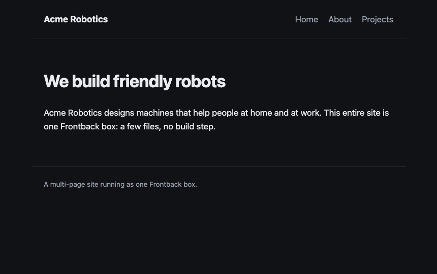
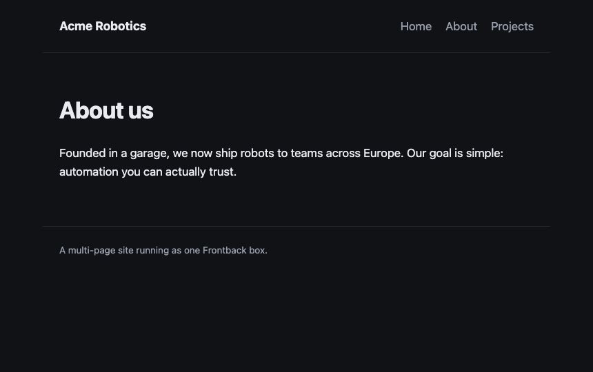
Several pages routed from one file, all sharing a single layout.
denohtmlrouting
A service can be more than one file. Here main.ts is a small router that maps each pathname to a page, and layout.ts holds the shared shell (header, navigation, footer) that wraps every page. Relative imports like ./layout.ts work exactly as you would expect.
The three pages are plain HTML defined in main.ts, and the stylesheet is served from public/ at /style.css. Add a page by adding one entry to the PAGES map. Unknown paths return a 404 that still uses the shared layout, so even the error page stays on brand.
// A small multi-page website. main.ts is the router: it maps the request// pathname to a page and wraps every page in one shared layout (layout.ts).// The content for each page is defined once, here, as plain HTML. The// stylesheet lives in public/ and is served for you at /style.css.import{ layout }from"./layout.ts";constPAGES:Record<string,{ title: string; body: string }>={"/":{
title:"Home",
body:` <h1>We build friendly robots</h1>
<p>Acme Robotics designs machines that help people at home and at work.
This entire site is one Frontback service: a few files, no build step.</p>`,},"/about":{
title:"About",
body:` <h1>About us</h1>
<p>Founded in a garage, we now ship robots to teams across Europe. Our
goal is simple: automation you can actually trust.</p>`,},"/projects":{
title:"Projects",
body:` <h1>Projects</h1>
<ul>
<li><strong>Sweeper</strong> - a tidy little floor robot.</li>
<li><strong>Gardener</strong> - waters your plants on a schedule.</li>
<li><strong>Courier</strong> - carries parcels down the hall.</li>
</ul>`,},};exportdefaultasync(req:Request):Promise<Response>=>{const{ pathname }=newURL(req.url);const page =PAGES[pathname];if(!page){const body =` <h1>Page not found</h1>
<p><a href="/">Back to home</a></p>`;returnhtmlResponse(layout("Not found", body),404);}returnhtmlResponse(layout(page.title, page.body));};functionhtmlResponse(html: string, status =200):Response{returnnewResponse(html,{
status,
headers:{"content-type":"text/html; charset=utf-8"},});}
// The shared page shell. Every page passes its title and its inner HTML; the// layout returns a full document with the same header, navigation and footer.// Keeping it in one place means the nav and chrome stay consistent across// pages. A service can be more than one file: main.ts imports this with a normal// relative import.constNAV=[{ href:"/", label:"Home"},{ href:"/about", label:"About"},{ href:"/projects", label:"Projects"},];exportfunctionlayout(title: string, body: string): string {const nav =NAV.map((item)=>`<a href="${item.href}">${item.label}</a>`,).join("\n ");return`<!doctype html>
<html lang="en">
<head>
<meta charset="utf-8" />
<meta name="viewport" content="width=device-width, initial-scale=1" />
<title>${title} - Acme Robotics</title>
<link rel="stylesheet" href="/style.css" />
</head>
<body>
<header>
<a class="brand" href="/">Acme Robotics</a>
<nav>
${nav}
</nav>
</header>
<main>
${body}
</main>
<footer>A multi-page site running as one Frontback service.</footer>
</body>
</html>
`;}